News

In production — 01.15.13

typotherapy: A book of creative thoughts—In Production On Press at Flash Reproductions.
typotherapy: A book of creative thoughts—In Production Press Sheets, Spot Varnish, Overprints, Metallic and Fluorescent Inks.
typotherapy: A book of creative thoughts—In Production Reviewing Plates, Mixing Inks, Tipped On Covers and Random Signatures.

typotherapy: A book of creative thoughts—In Production

On press overseeing our Wayward Arts Studio Series creation—
typotherapy: A book of creative thoughts.
The book, which is much of an experiment, is printed on a synthetic paper by Yupo (supplied by Unisource) and possesses unique qualities including an ultra smooth texture. The paper is resilient and also waterproof. It was originally developed to print signage and safety documents specifically for the manufacturing sector and factories that must have these materials protected from the elements. Because of the paper’s specifications and extravagant price, it was not widely used for conventional print projects. Nevertheless, it’s interesting to know that our book is essentially impermeable and you could probably read it underwater.

We spent a few days on press working closely with Flash Reproductions to oversee the printing. From a technical perspective, the book is printed with a range of techniques such as stochastic printing, spot varnish, overprinting, metallic, fluorescent inks, tipped on covers and signatures that are collated randomly. We really enjoyed having the opportunities to review not only the press sheets, but overseeing everything from the plates, mixing the inks, to working closely with prepress to realize our overall vision. We even learned a few new tricks that will definitely be useful in the future. Working with Flash was not only a pleasure, but also a prefect pairing by letting us experiment and having the expertise to make it happen.

Announcements — 06.01.12

Wayward Arts typotherapy

Wayward Arts

Wayward Arts
Summer 2012
Wayward Arts / Flash Reproductions expressed to us their concept of collaborating with inspiring design studios to produce a series of unique publications filled with innovative designs, featuring specialty printing and finishing techniques.

We are over the moon (and nervous) to find out we were chosen to be the inaugural studio to the launch the series.

Miscellaneous — 01.01.11

Inigo Food Restaurant Storefront Signage
Inigo Food Restaurant Logotype and Marque

Inigo Food Restaurant

Inigo Food Restaurant
Brand Identity
typotherapy recently worked closely with chef Carlos Hernandez to develop the brand identity for his new restaurant Inigo Food; a Queen West takeout spot at the southern end of Trinity-Bellwoods Park offering an interesting take on the Portuguese churrasqueira. As a result, an adaptable, unique logotype with a cheerful typographical presence, and a marquee that depicts a playful interpretation of a spark was created for the cafe-sized space.

MyType — 09.01.10

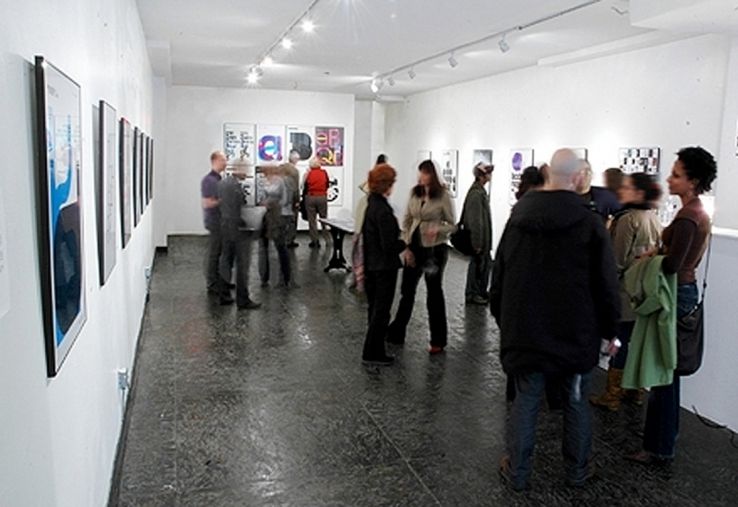
MyType Exhibition MyType Opening

MyType Exhibition

MyType Exhibition
Years ago typotherapy put on a show of eye-popping type-based posters called MyType. The show featured posters of original typefaces designed by creative director Noël Nanton. The limited-edition posters reflecting his own, very new take on classic modernist typography while exploring the relationship between positive and negative space.

While the show was a huge success, Noël reflects on the rational behind creating the typefaces for the posters featured in the show.

MyType — 08.15.10

MyType (Behind the Type) – VWmobile MyType VWmobile [aa] Poster

MyType (Behind the Type) – VWmobile

MyType (Behind the Type) – VWmobile
Q: This poster was used for the branding of the show. Why and how did this typeface come to fruition?

A: We instantly gravitated to the VWmobile [aa] poster for the show’s brand personality. We felt that the overlapping letters is a very powerful yet common metaphor in type design when comparing letterforms. Furthermore we thought that this would be a prefect way of introducing people to the world of type.

VWmobile came into existence in 2007 when typotherapy was commissioned to redesign and rename the Ontario Association of Landscape Architects (OALA)’s magazine. Ground magazine was literary redesigned from the ground up – no pun intended. When we approach a new project, one of the first design elements we consider is the fonts. Often, typotherapy custom designs a font specifically for the project in order to give the brand a distinct identity. Thus VWmobile was born – a geometric, sans-serif font with a modern, inviting, easy-to-read look and feel. VWmobile is the font used for the body copy in Ground magazine.

The full VWmoblie family consists of: VWmobileA, VWmobileB, VWmobileC. They all include, light, light italics, bold, bold italics and display weights and contain letterform variations for the letters ‘a, b, f, and t’.

MyType VWmobile [aa]
Size: 24”x 33” / 3 colour litho
Poster: designed by Noël Nanton @ typotherapy — 2008
Typeface: designed by Noël Nanton @ typotherapy — 2007

MyType — 08.01.10

MyType (Behind the Type) – Witruimte Witruimte [1,2,3] English Poster
MyType (Behind the Type) – Witruimte Witruimte [1,2,3] Dutch Poster

MyType (Behind the Type) – Witruimte

MyType (Behind the Type) – Witruimte
Q: What inspired this typeface?

A: This typeface Witruimte, was inspired by a trip to the Netherlands. I was totally impressed by how the Dutch embraced design, especially graphic design and typography. In Amsterdam, you see good design everywhere.

While there, I was introduced to the work of a remarkable Dutch designer and typographer, Wim Crouwel. I was impressed by Crouwel’s legacy in type design and mostly by a calendar he designed in 1963 called “Kalender ’64”. This led to an exploration of framing letterforms – as if each letter is in its own invisible picture frame.

Often, when designing letterforms we will first type out a word to get a glimpse at the new typeface. With regards to the creation of these framed letters, we immediately and instantly witness a unique juxtaposition between its positive and negative space, and Witruimte (wit ruimte) – literally means white space in Dutch was born.

The Witruimte poster features a play on words and numbers counting down from 1 to 9 in both English and Dutch.

Witruimte [1,2,3] English
Witruimte [1,2,3] Dutch
Size: 24”x 33” / 1 colour screen print
Posters: designed by Noël Nanton @ typotherapy — 2008
Typeface: designed by Noël Nanton @ typotherapy — 2008